| Step
1: Creating a
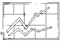
Worksheet Step 2: Selecting Data to Graph Step 3: Selecting the "Chart" Wizard Step 4: Graphing Data Step 5: Adding a Trendline Conclusion: Analyzing and Interpreting the Graph |
 |
| Step
1: Creating a
Worksheet Step 2: Selecting Data to Graph Step 3: Selecting the "Chart" Wizard Step 4: Graphing Data Step 5: Adding a Trendline Conclusion: Analyzing and Interpreting the Graph |
|